The Project
A Canadian airline’s loyalty programme generates two datasets — flight activity records and customer profiles — that together contain everything needed to understand who their customers are, how they fly, and how they engage with the programme. This project merges, cleans, and analyses both to surface the structural patterns behind customer behaviour and tier distribution.
Approach & Technical Execution
Phase 1 — EDA & Data Cleaning
Initial exploration of both datasets independently before merging on Loyalty Number. The 95.87% duplicate rate on customer IDs in the flight dataset was expected — one row per customer per month of activity, not per customer.
The three cleaning decisions were each driven by the structure of the data:
- Salary nulls: The
Educationcolumn had no ‘College’ category, leaving all College-level customers without a salary value. Rather than applying the global mean, the imputed value was calculated as the midpoint between the adjacent education levels — preserving the salary-education gradient visible in the data. - Cancellation fields: Null values represent active customers. Imputed with
0and converted toint, encoding “cancellation has not occurred” in a way that is operable and consistent with other date columns. - Points Accumulated: Stored as float despite representing whole loyalty points. Rounded and converted to
intto align withPoints Redeemedand remove misleading decimal precision.
Phase 2 — Visualisation & Descriptive Statistics
Six analytical questions explored on the cleaned dataset, with visualisation type selected based on the structure of each variable pair:
- Monthly flight bookings → line plot (temporal trend)
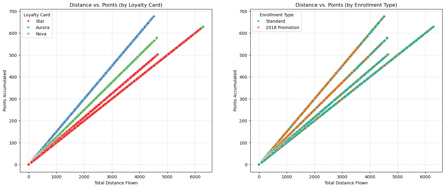
- Distance vs. points accumulated → dual scatter plot segmented by loyalty tier and enrollment type
- Customer distribution by province → bar plot
- Salary by education level → bar plot + box plot
- Loyalty card tier proportion → pie chart
- Marital status and gender → count plot
Key Findings
Seasonality is strong and predictable. Flight bookings peak in July–August and trough in January–February, with steady growth through spring. The pattern is consistent enough to support forward planning.
Points accumulation is mechanistically tied to distance. The scatter plot shows strong positive correlation with low dispersion — miles flown drive points earned. Multiple diagonal lines confirm that tier and enrollment type create distinct accumulation rates, with the 2018 promotion cohort earning at a higher rate than standard enrollees.
~50% of customers are at the entry-level tier. The loyalty pyramid is bottom-heavy. Whether current incentives are sufficient to drive tier progression is an open question the data raises but cannot answer alone.
Education is a reliable salary proxy. Clear positive gradient across all levels, with the largest gap between Master’s and Doctorate — doctoral holders earn approximately double the lowest tier.
Geography is concentrated. Ontario, British Columbia, and Quebec account for the majority of customers. The dataset is 100% Canadian.
Stack
Python Pandas NumPy Matplotlib Seaborn