The Project
Friends ran for 236 episodes across 10 seasons, holds an IMDb average of 8.46, and has remained culturally alive for decades after its finale. But some questions the official data can’t answer: who spends the most on coffee? How much time does each character actually spend at Central Perk? Who says their iconic catchphrase the most?
This project builds those answers from scratch — combining real viewership and production data with datasets generated through generative AI — and presents them across four interactive dashboards with a custom visual identity.
Technical Approach
Dataset generation with AI
Three of the datasets didn’t exist as structured sources: estimated coffee spending per character, time spent at Central Perk, and guest star appearances by episode. Each was built by gathering real but scattered information from multiple sources and structuring it into CSVs using generative AI — a process that requires editorial judgment to determine what data is reasonable, verifiable, or defensibly inferred.
Calculated measures in Tableau
The dialogue dashboard goes beyond simple line counts. Calculated measures were created inside Tableau to filter and quantify specific phrases by character and season — making it possible to cross-reference who says “How you doing?”, “We were on a break”, or “Unagi”, how often, and across which seasons.
Custom color palette and thematic design
A custom palette was defined inspired by the show’s visual world: warm browns, ochre tones, and the dark green of Central Perk, with burgundy as an accent. Chromatic consistency carries across all four dashboards. The character filters in the iconic phrases panel use each actor’s photo as an interactive selector — a UX decision that merges visual identity with functionality.
The Dashboards
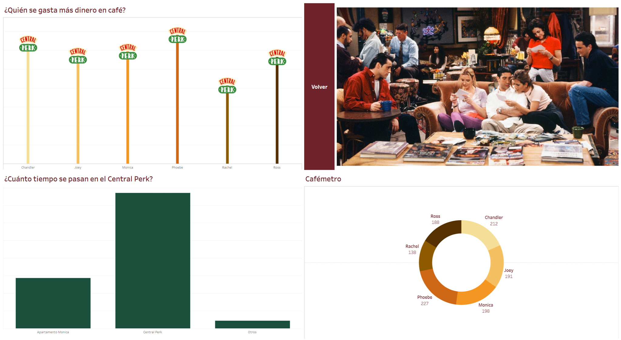
Central Perk — Who spends the most on coffee, and how long do they stay? Bar chart using the Central Perk logo as a custom marker, a “Coffeemeter” donut chart by character, and a time comparison across Monica’s apartment, Central Perk, and other locations.
Show Success — Series KPIs (236 episodes, 10 seasons, IMDb average 8.46), top 10 directors by episode count and by rating, and a viewership line chart in millions across the full run — with a visible spike corresponding to the most-watched episode in NBC history.
Who Talks the Most? — Dialogue distribution by character with a season filter, a word cloud of the most frequent terms in the scripts, and treemaps by iconic phrase showing which character says it most. Chandler leads the total line count; Joey dominates “How you doing?”; Ross, predictably, monopolizes both “We were on a break” and “Unagi.”
Guest Stars — Full cameo table with actor, character, and role description; top 5 by number of appearances (Bruce Willis leads); breakdown by cameo type (guest arc, one-off cameo, recurring character); and filters by actor and season. The panel header — “When losing a bet means acting in Friends” — references the real origin of Bruce Willis’s cameo.
Key Findings
Dialogue distribution among the six leads is remarkably even — none exceeds 18% of total lines — which partly explains the ensemble’s cohesion. Viewership doesn’t decline linearly: there are notable recoveries in later seasons coinciding with key narrative arcs. Paul Rudd (Mike Hannigan) is the most-appearing recurring guest character, with nine episodes across seasons 9 and 10.
Stack
Tableau Public Generative AI (dataset generation) Custom Color Palette